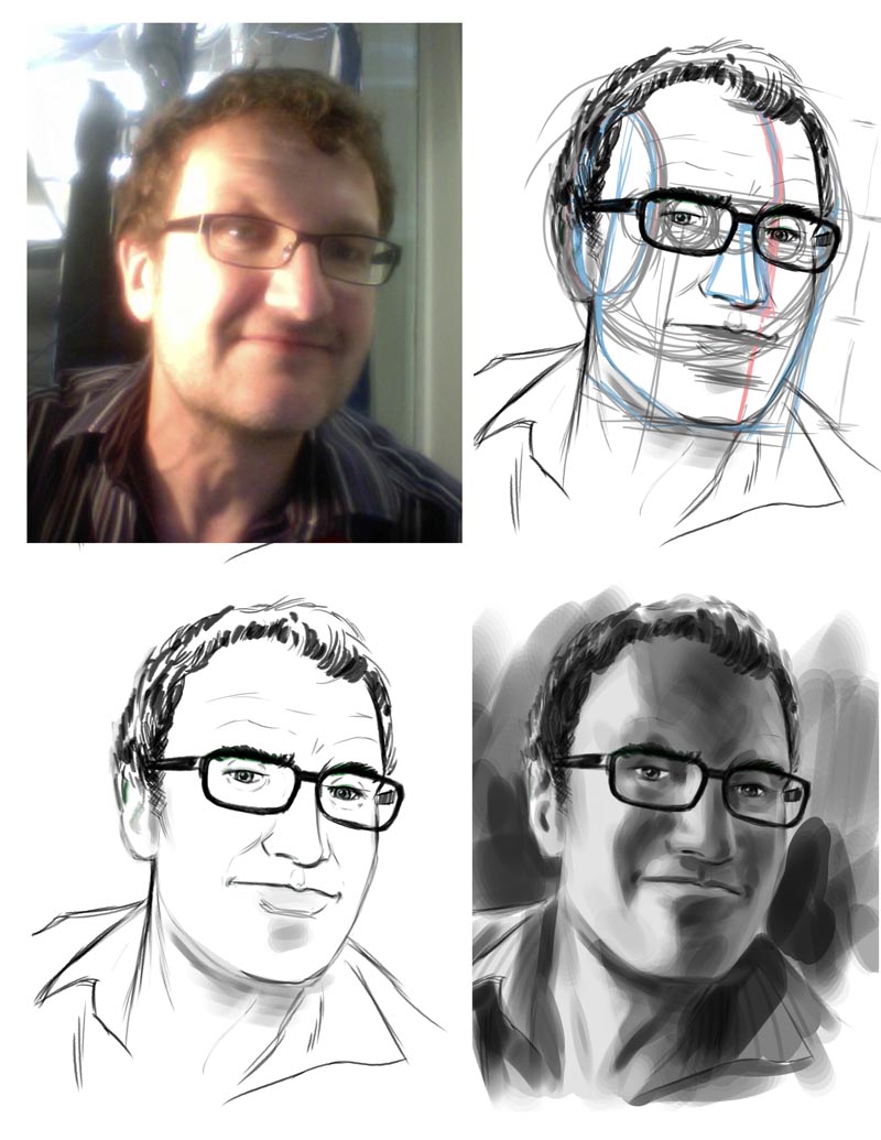
Open a new file in Photoshop. Use our usual size: 8.5" by 11" at 300 dpi. Open the Photobooth photo and drag it into the new file window. Size it up to fit nicely in the available space, change the photo layer's mode to "Multiply" and reduce the photo layer's opacity a little so it appears somewhat faded. Now using a "pencil" brush, like the one we created in Lesson 2, start working on a construction drawing of the head as we learned in Lessons 6 & 7. You can work either on the background (below your photo layer) or on a new layer above your photo.
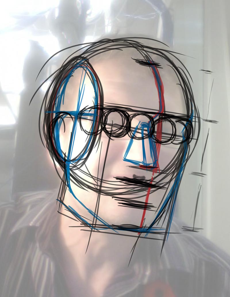
Once you've completed the construction drawing using basic shapes and applying the rules of proper proportion to establish the location of the facial features and the planes of the face and head, reduce the opacity of that layer - and further reduce the opacity of your photo layer - and begin a clean line drawing on a new layer. Use both the construction drawing and the photo to help you draw this clean line artwork. DO NOT simply trace the photo!
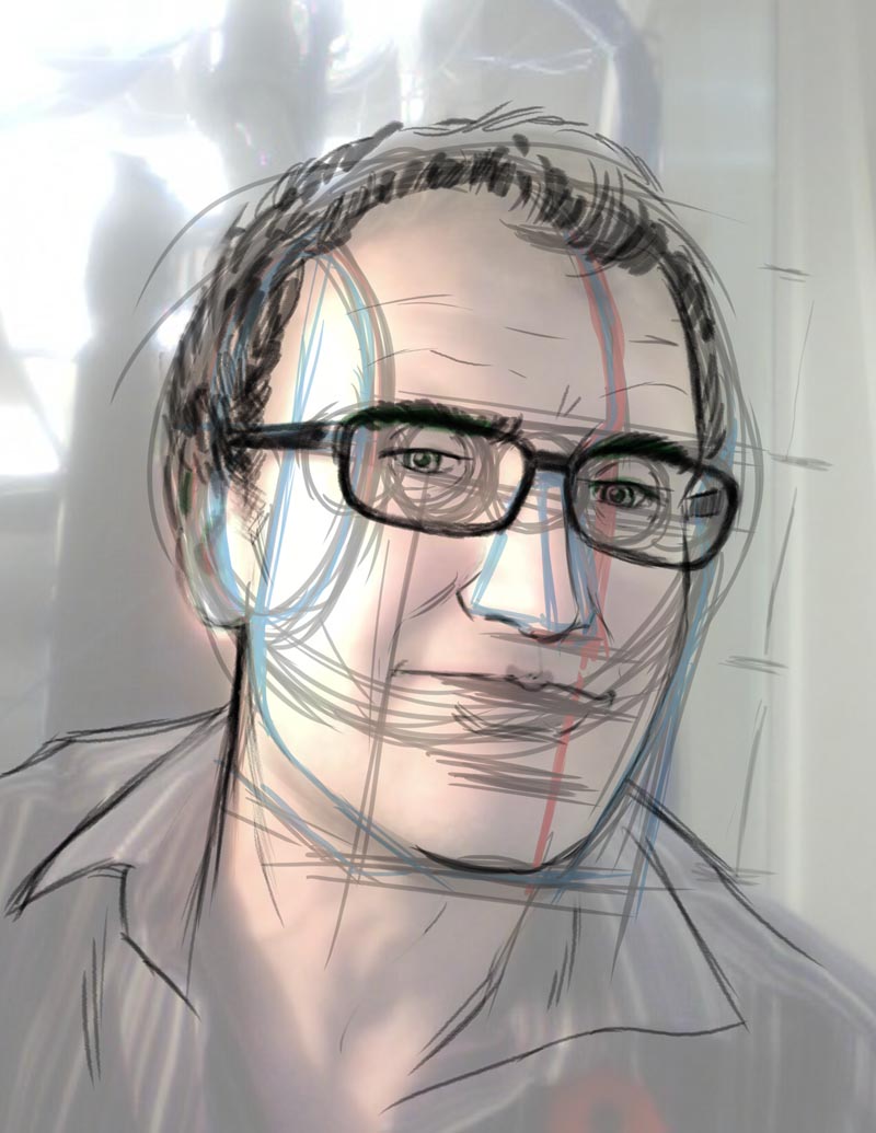
Continue refining your line drawing...

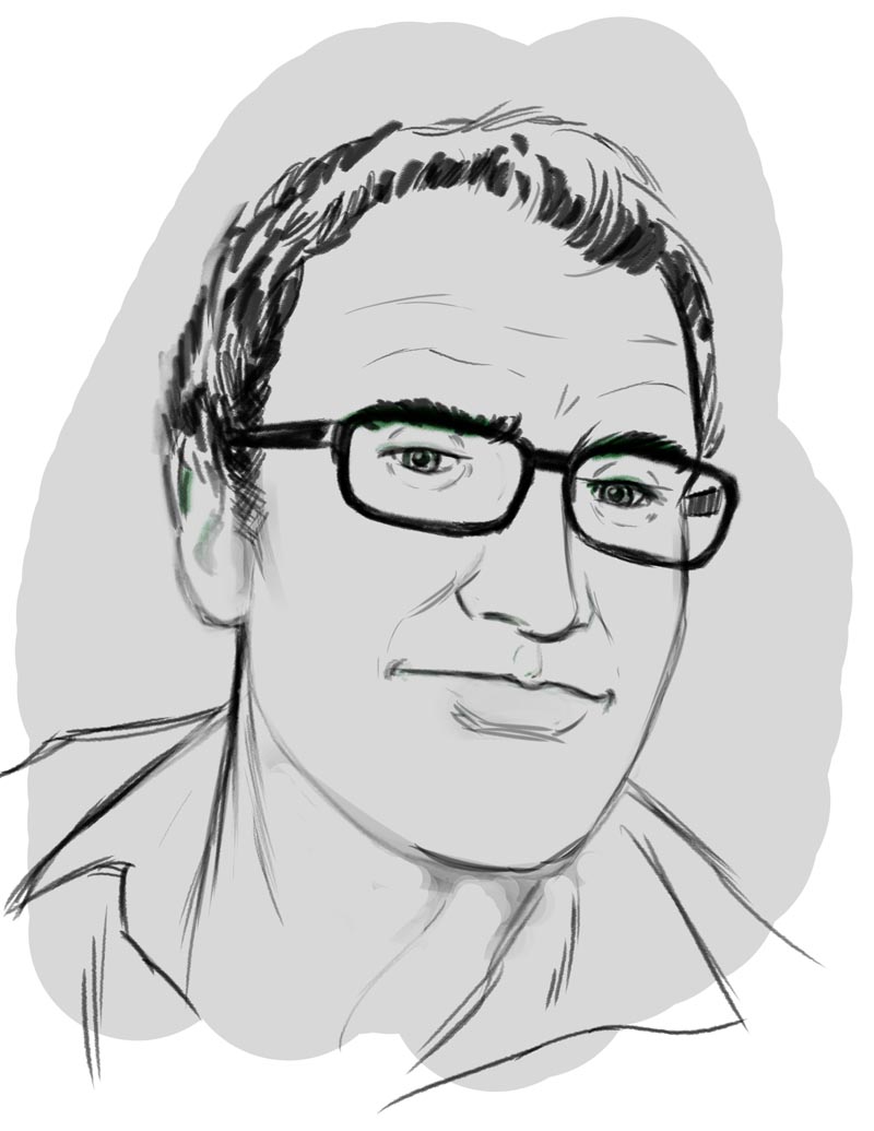
When you're satisfied that you've completed enough of the line drawing to give you an accurate linear version of your head, turn off the construction drawing layer and the photo layer. Make sure you've set up the layers so you have a clean white background under the line art layer.
Now take a look at this 4 - step lesson by Jon Whitcomb on painting the head in grey tone. Study each step carefully. What Whitcomb did in ink wash on illustration board back in the 1950s, we will attempt to do with 'digital paint' in Photoshop!
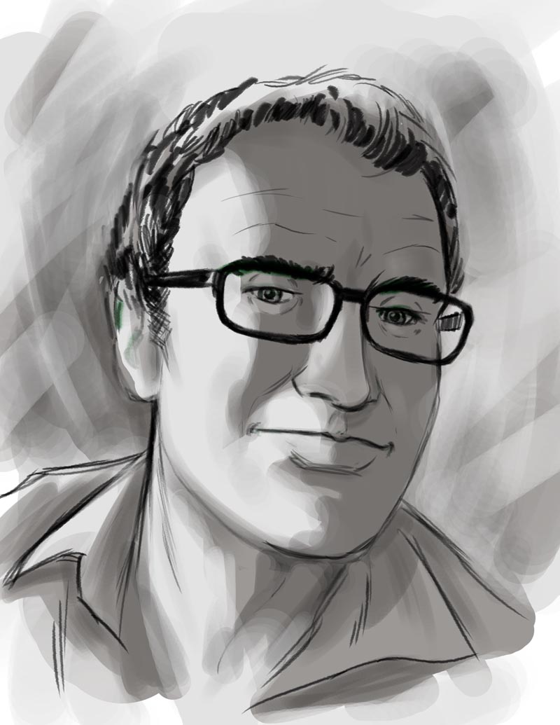
Notice that in these early painting steps above and below I'm using one of the simple brushes from the top row of the Brushes Palette. I use the brush anywhere from 150 to 300 pixels and I use just two grey tones (a fairly light one and a fairly dark one) to very roughly establish the two large tonal masses on the face (and even some painterly shapes in the background). I'm not at all concerned with "staying in the lines" at this stage.
Again, don't worry about being very accurate at this first stage of painting. Don't concern yourself with trying to indicate small pools of light or shadow. Just look at your photo for the large masses of light and shadow and approximate them on your painting layer.
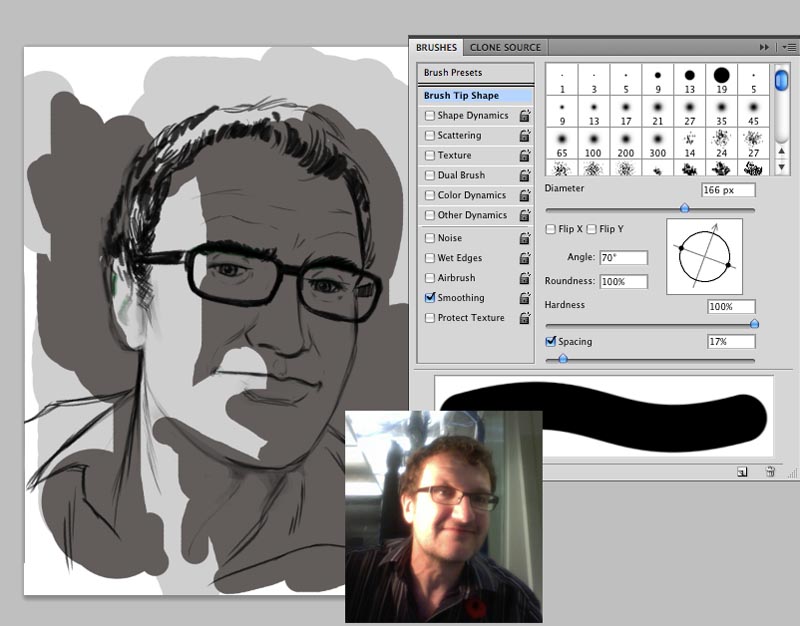
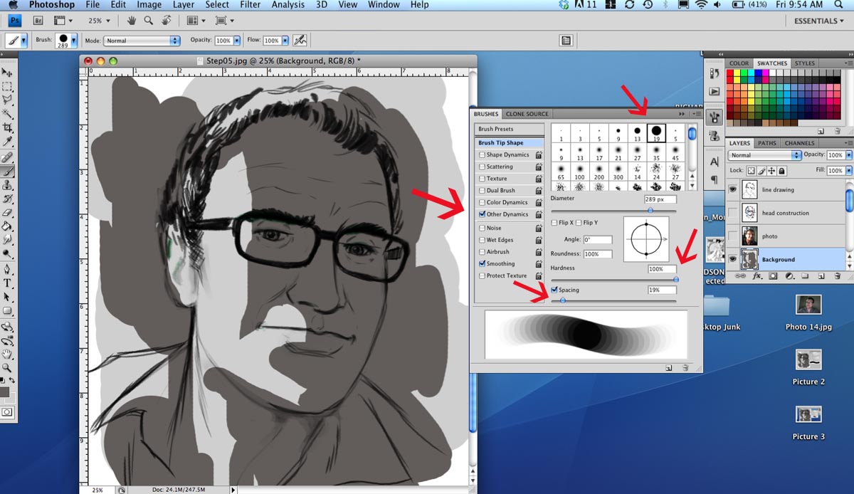
Once you've quickly laid in these large, flat, solid tones, its time to build the brush you'll be painting with. Note that in the Brushes palette window I'm still using the big brush from the top row, but I've unchecked all the Brush preset options we normally use (like Shape Dynamics) and checked instead only the "Other Dynamics" option. ("Smoothing" can remain checked as always).
A couple of other important variable I want you to set: the "Hardness" slider should be at 100% and the "Spacing" slider should be at around 20% (see the red arrows in the screen capture below).
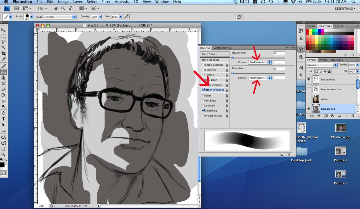
* If you're not seeing the Brush preview as a swooping series of overlapping circles that fade at both ends (as in the screen capture) then click on the "Other Dynamics" preset option and adjust the Opacity Jitter and Flow Jitter Controls to "Pen Pressure" (see the red arrows in the screen capture below).
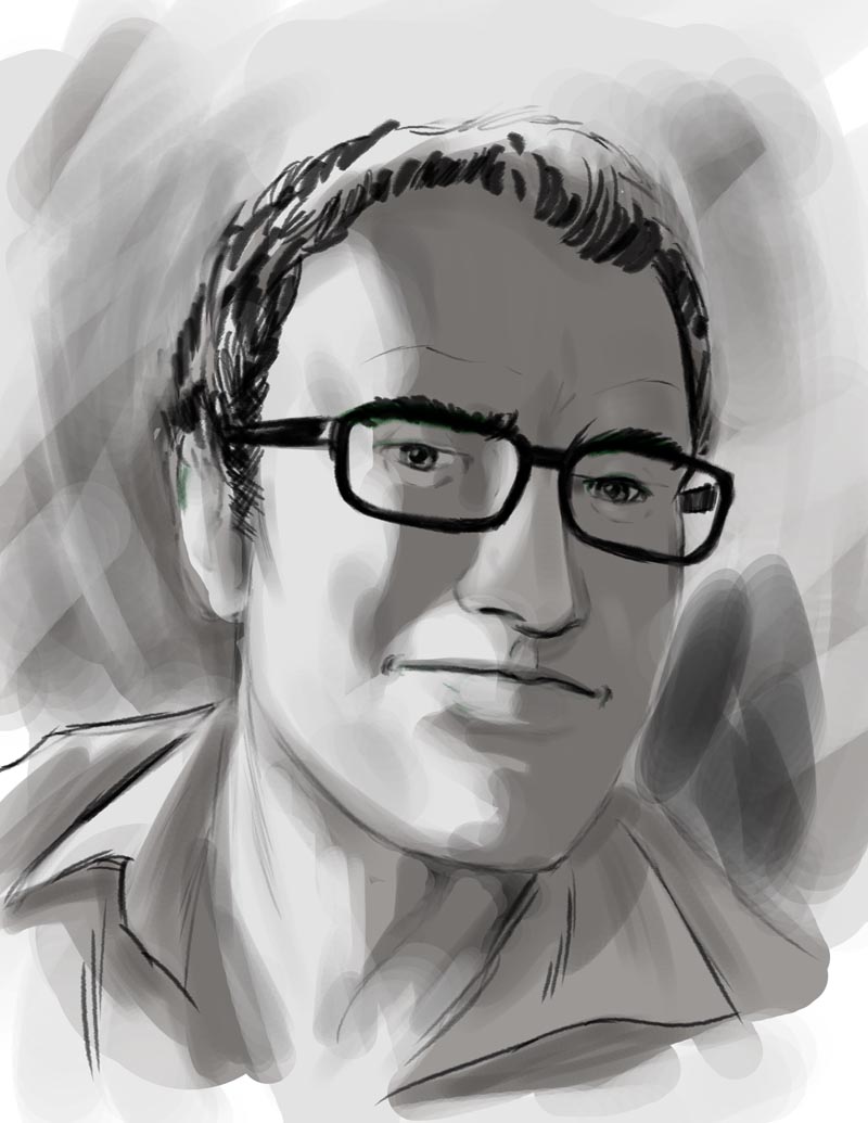
Using only the two tones you've already established in your piece, use this new painting brush to soften and refine the edges between the two values, as shown below. Just keep flipping the two tones around in your Foreground and Background palettes in the Toolbox menu and paint the two tones back and forth as you begin to establish some of the secondary pools of light and shade. Notice that if you don't press too hard that the strokes fade and blend together in a nice way.
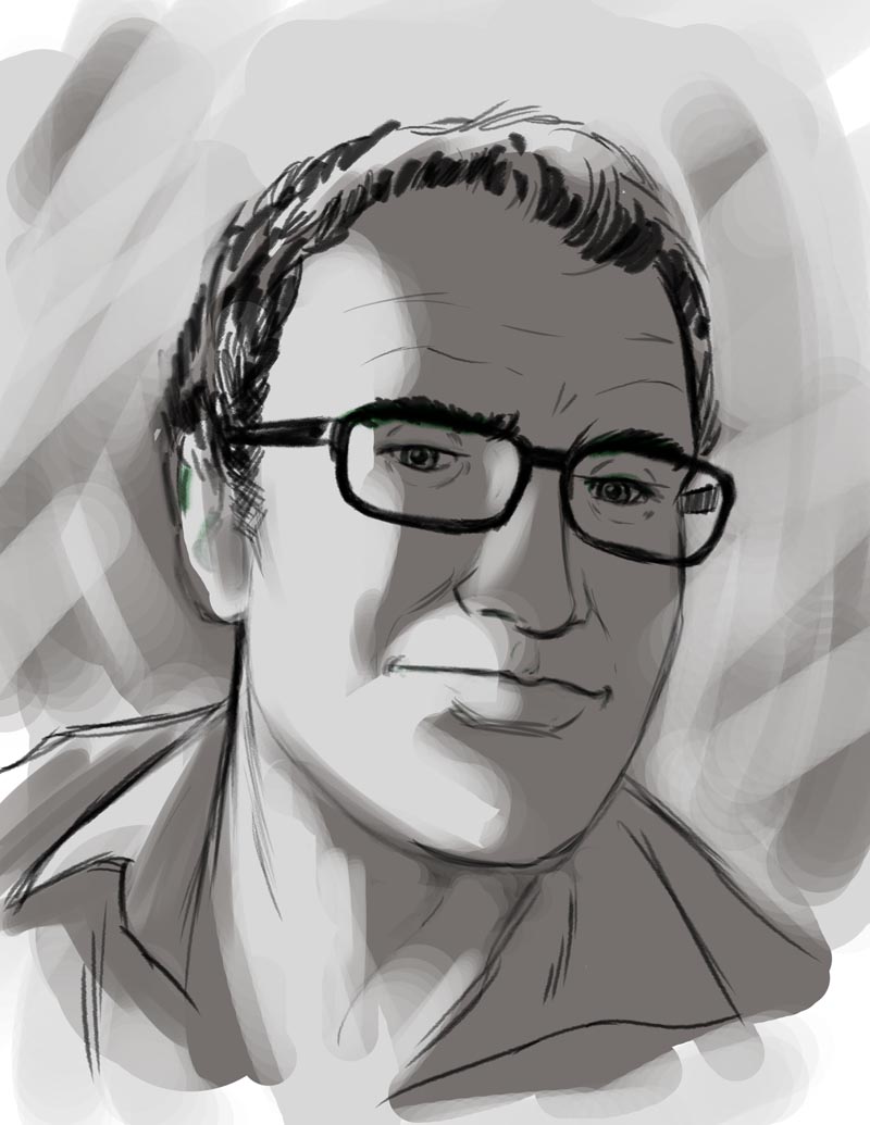
Continue to blend, to define areas of light and shade, and remember to work all the areas of your painting at once. Don't get too focused on one area of detail and forget the rest of the painting!
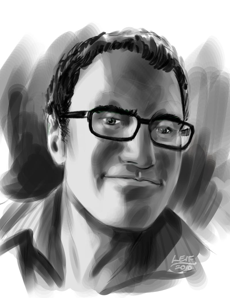
As you begin defining more of the planes of the face with painted light and shade, try subtly erasing some of your line art (save a copy of the line art on a duplicate layer that you've turned off).
As you erase the line art, look critically at that area and decide if the tone is holding the form or if you need to paint a lighter or darker value into that spot to make it 'pop'.
The jump between the last step and the final stage may seem quite dramatic, but at this stage there's not much to say except that you need to continue painting in light and dark values using good observation and critical, artistic judgement about how you're defining the different planes of the face. Remember to work all around the composition, and to keep the large masses of light and shade intact! Don't break those areas up by overworking the details. As mentioned above, keep erasing line artwork and deciding if the area still holds up without line - then adjusting the values as you go along.
Email your flattened 150 dpi jpeg file to me as you see below. Email the assignment to pengprofessor[at]gmail[dot]com